PPC & Web Optimization Case Study: How I Skyrocketed Website Conversions by 271.84% for School Teachers Education Product
A/B Testing Success: Boosting Conversions and Decreasing Costs for "Multiplication Secrets"
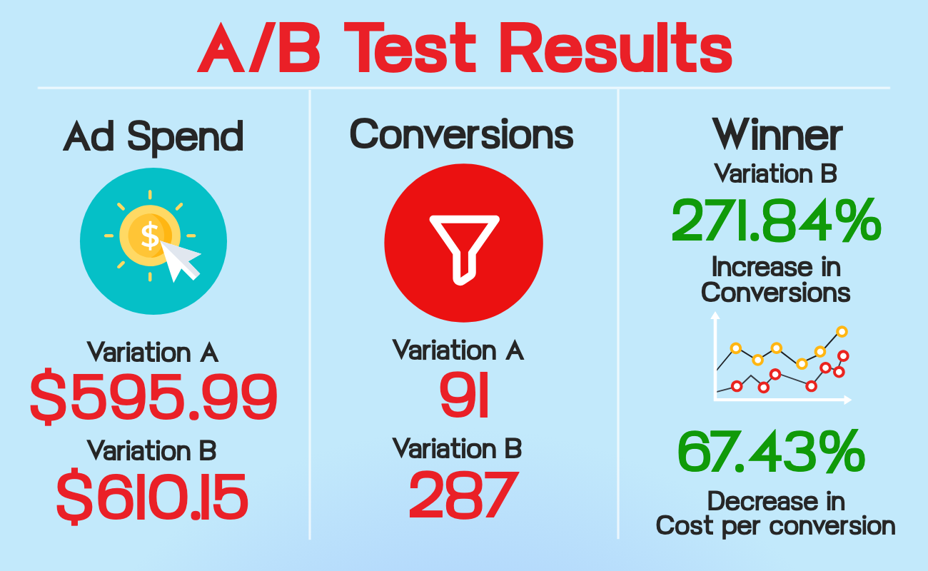
Table of Contents
- Introduction: Unlock Your PPC Success: Achieving Remarkable Results for 'Multiplication Secrets'
- A Quick Look at the A/B Test Results
- About the Product and Goals of the Business for This Test
- The Funnel Strategy
- How I Measured Conversions
- The Website Landing Page Variants
- About the Original Landing Page Design
- Problem 1: Understanding the Target Audience
- Problem 2: Geographic Language Differences
- Problem 3: Mismatched Graphics and Product
- Problem 4: Inaccurate Logos and Misleading Advertising
- About the Ad Campaign
- Problem 5: Low-Quality Video
- Conclusion
Unlock Your PPC Success: Achieving Remarkable Results for 'Multiplication Secrets'
Ready to unlock a surge business? If you’re not quite sure how to get more leads or website conversions for your business, this case study is for you.
In this dope A.F. case study I’m going to show you exactly how I skyrocketed on site conversion for Multiplicationteacher.com by 271.84%, all while decreasing the costs per click, impression and conversions… SIGNIFICANTLY.
At the end of this case study you’ll have a stellar new set of A/B testing techniques in your toolbox… If you’re not overjoyed with this newfound knowledge, reach out to me and I will personally send you 7 bananas.
Let’s get started, shall we?
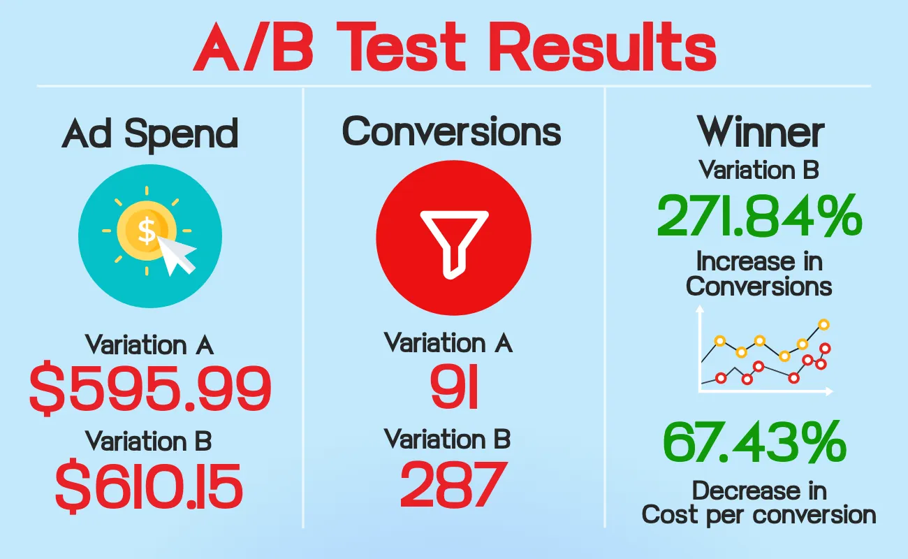
A Quick Look At The A/B Test Results:
Results of Variant A:
- Ad Spend: $595.99
- Impressions: 67.08K
- Clicks: 1.91k
- Cost per Click: $0.31
- CTR: 2.84%
- Total Conversions: 91
- Conversion Rate: 4.77%
- Cost per Conversion: $6.54
Results of Variant B:
- Ad Spend: $610.15
- Impressions: 51.07k
- Clicks: 1.62k
- Cost per Click: $0.37
- CTR: 3.92%
- Total Conversions: 287
- Conversion Rate: 17.75%
- Cost per Conversion: $2.13
Results: Variant B Takes the Crown
Despite a minor increase in cost per click from $0.31 to $0.37, Variant B delivered impressive improvements across the board, including:
- 271.84% relative increase in conversions (12.98% absolute increase)
- 67.43% decrease in cost per conversion
About the Product and Goals of the Business for This Test
The product - Multiplication Secrets: An online video course called "Multiplication Secrets," developed by a brilliant school teacher with a 100% success rate in helping students memorize times tables 0-12 in just seven days.
The Goal: To launch and validate the product online, focusing on driving sales and measuring market interest.
Target Demographic: Parents with kids learning multiplication (roughly 3rd to 5th grade in the US)
The Campaign Type and Platform: Keyword Search Engine PPC Marketing Via Bing Ads (aka Microsoft Advertising)
The Campaign Duration: 30 Days
Overall Ad Spend: $1200 (roughly $600 to each variant, give or take a few dollars)
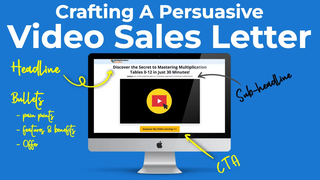
The Video Sales Letter: While I did an overhaul of the page design, I didn't redo the video sales letter. that was the same on both pages. You can read more about how I wrote the copy for that in THIS blog post.
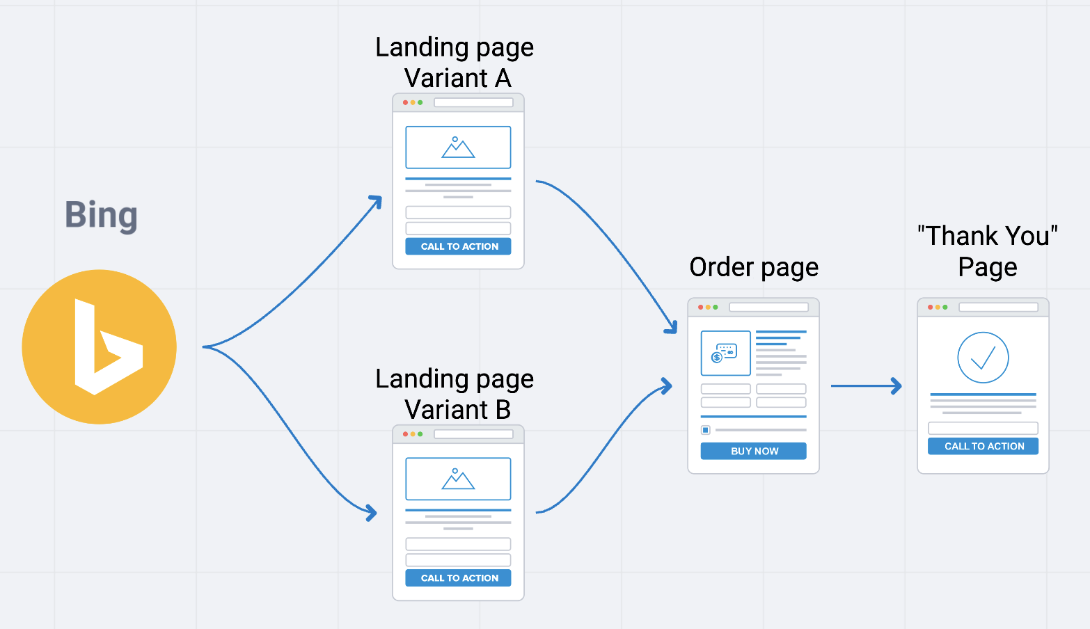
The Funnel Strategy
In the graphic below you can see the overall funnel strategy. Because the business owner merely wanted to validate if this product would sell, I chose a simple 4 step funnel I know works for this purpose....
- Run paid ad
- Link ad to landing page variants (A and B)
- Link both variants to the payment page
- Redirect to the post purchase "Thank You" page
How I Measured Conversions
Because this was the first step in validating this process the primary focus was on trying to get as many clicks from the landing page to the payment page.
While we obviously wanted to get as high of a conversion on the payment page as possible, this was the first time any traffic had been run to this funnel, so getting the landing page dialed in was crucial.
Because of that, for this test I chose to make my "conversion" event anytime someone clicked from either of the landing pages to the payment page.
You'll notice I don't mention "ROI" or "Revenue" for this A/B test. This is for 2 reasons:
- This case study is specifically for measuring how many people started the checkout process... not how may completed it.
- As this is not my product, I do not have permission from the business owner to share exact numbers on revenue.
The Website Landing Page Variants:
A Sneak Peek into the Designers Behind the Variants:
For the A/B split test, I collaborated with another funnel builder who designed landing page variation A, which I may refer to as the "original" variation.
Though, after reviewing variation A, I found several issues that left me dissatisfied with the designer's work, so I decided to undertake a complete overhaul and personally design variation B.
This is what laid the foundation for the A/B test we conducted.
Before getting knee deep into the details of the test, here's a side by side comparison of the original designers work (var. A) next to my design (var. B):
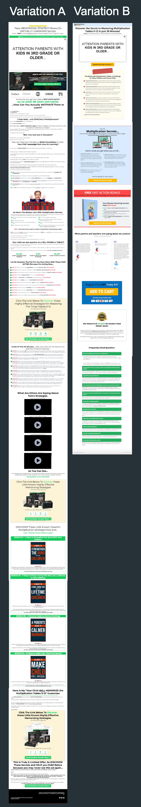
Variant A (Original Design)
Website: Formerly Multiplicationsecrets.com, now https://casestudyexample.growthbooster.co/
Branding & Coloration: Appealed to entrepreneurs with black and bright green colors, not friendly-looking
Product Cover Graphic Design: Misleading, appeared as a book instead of a video course, causing confusion
Variant B (My Design)
Website: Rebranded to Multiplicationteacher.com
Branding & Coloration: Created a mom and kid-friendly atmosphere with a lighter color scheme resembling a school room
CTA: Enhanced the Call to Action to resonate with parents' desires
Keyword Themes: Optimized by cutting irrelevant themes for better targeting
About the Original Landing Page Design:
Original Landing Page: https://casestudyexample.growthbooster.co/
This landing page used to be Multiplicationsecrets.com, but since it lost to my variation, it has been unpublished. However, I have permission to use it as a case study example.
What I Noticed Was Wrong with the Landing Page and How I Fixed It:
Problem 1: Inappropriate Design for the Target Audience
The biggest issue I noticed with this landing page was that whoever designed it didn’t understand the psychographics of the target audience.
This is a product that helps children memorize the times tables. This means that the target people we’re trying to sell to are parents who have children roughly in the 3rd to 5th grade range (speaking specifically of the U.S. now). Likely, the people purchasing this would be mothers between roughly 25 and mid 40’s.
To me, it looked as though whoever designed this landing page was trying to market to entrepreneurs, which is a completely different demographic. This affected not only the visual design, but the copywriting and overall tone of the product.
If you don’t believe me, go look at the landing page for “Traffic Secrets”... a popular book written by Russell Brunson on the topic of digital marketing. You’ll notice that, aside from the sales copy, it’s almost identical in terms of coloring and fonts and product graphics. (See images below)
NOTICE: The original landing page design was ripped straight from Russell Brunsons "Traffic Secrets"....
HERE'S THE COMPARISON...
👇👇👇
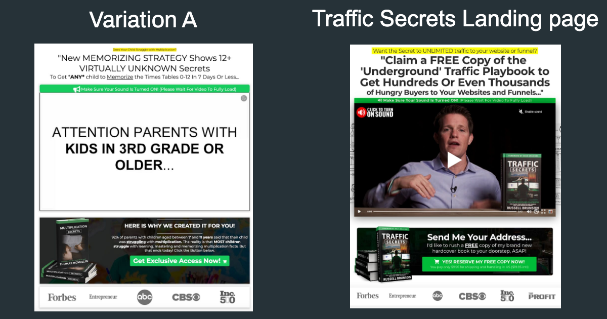
Why this doesn't work...
My hunch is that the previous funnel builder saw a formula that worked. Indeed, I was able to meet this funnel builder and I’m pretty sure he is having some great success building landing pages like this for his other clients.
The issue (from what I gather) is that all of his other clients are selling entrepreneurial/business products, not products for children.
To fix this, on variation B, I chose to go with a much lighter color scheme. I swapped out the green button for a friendlier yellow button and included some light blues
Problem 2: Geographic Mismatch and Language Issues
The issue here was that the original landing page design was done by someone who was using British English as the foundation of his copywriting.
Because of this, the word "MEMORIZATION" was spelled spelled with an "S" instead of a "Z", making it "MEMORISATION".
While this isn't technically incorrect, it was inappropriate as we were initially targeting customers in the United states.
Problem 3: Graphics Misrepresenting the Product
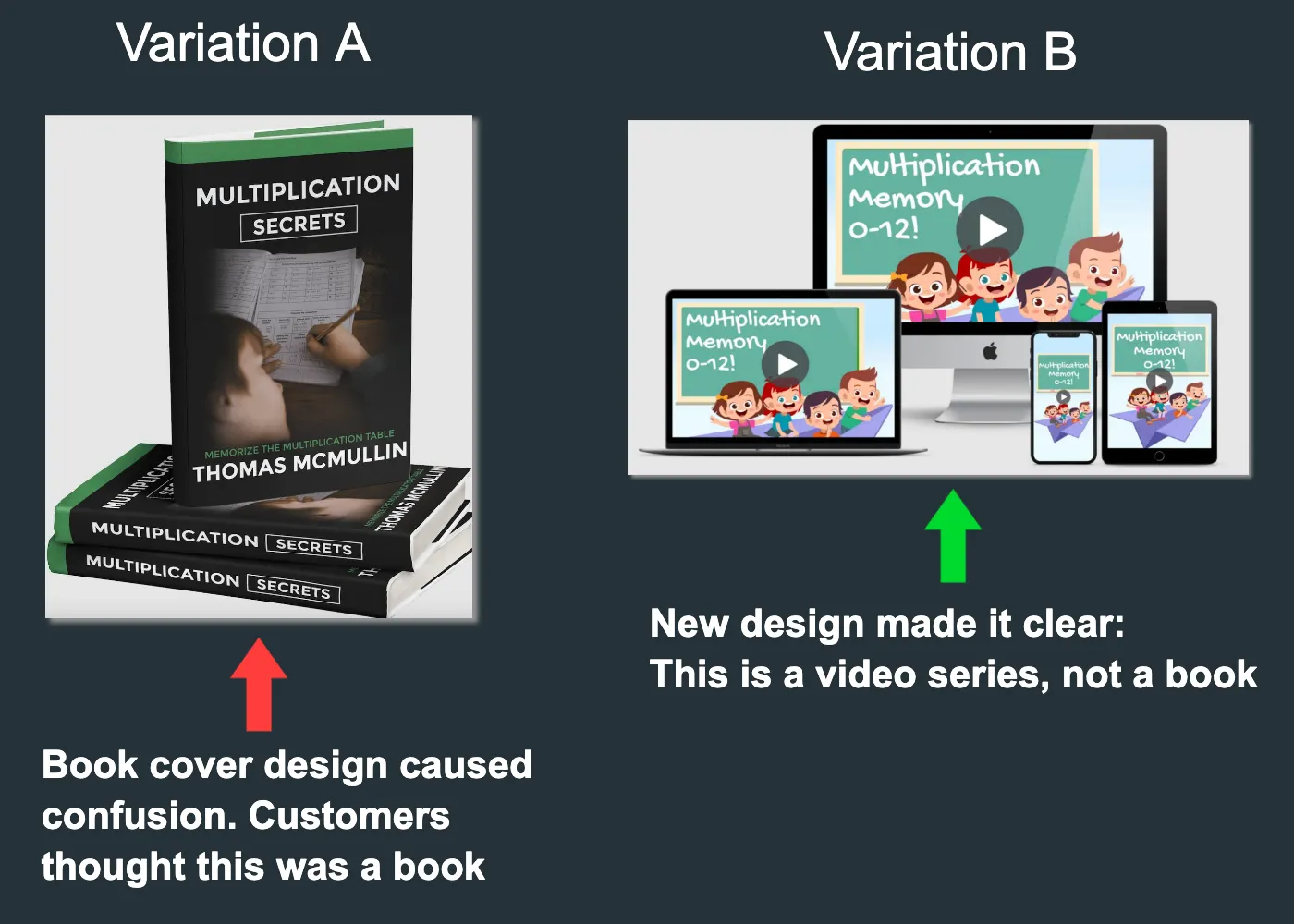
The original box shot that was created for this product was a book cover. Being that we were trying to sell an online course, I'm not sure why the designer went this route.
That said, it seemed likely that this would cause confusion... and indeed, when I did some small scale user testing, this was the biggest point of confusion.
To rectify this, I redid the design for this using computers, tablets and cell phones in the box shots... as you can see in the image below...
Problem 4: Misleading Use of Logos
On landing page A, there were use of logos from Forbs, Entrepreneur Magazine, ABC, CBS and Inc. 500. I've seen landing page designers use this before as a tactic to gain credibility.
Here's the rational I've heard other marketers use (and what I assume the original landing page builder's mindset was): "Well, I'm just putting the logos on there, I'm not saying that this product has ever actually been SEEN in any of those places"...
True... you're not technically making a false statement. However, this is EXTREMELY misleading. As someone who take advertising regulations VERY seriously, I know that this sort of thing can not only get you banned from advertising platforms, it get you sued in the United States.
My solution: Get rid of it. We're just trying to validate a product... there is no need to put that sort of risk on the business owner.
Problem 5: Low-Quality Video Presentation
While this was something I wanted to fix, in the time allotted, it just wasn't possible.
About the Ad Campaign:
Ad Platform: Bing Ads (A.K.A. Microsoft Advertising)
Campaign Type: Smart Campaign Search Ads
Ad Copy: I used the exact same copy for both variations, focusing on captivating the target audience with compelling messaging.
Keyword Themes: While not altering the themes drastically, I strategically cut irrelevant themes in Variant B to optimize ad spend and target more intentionally.
Vartion A Keyword Themes
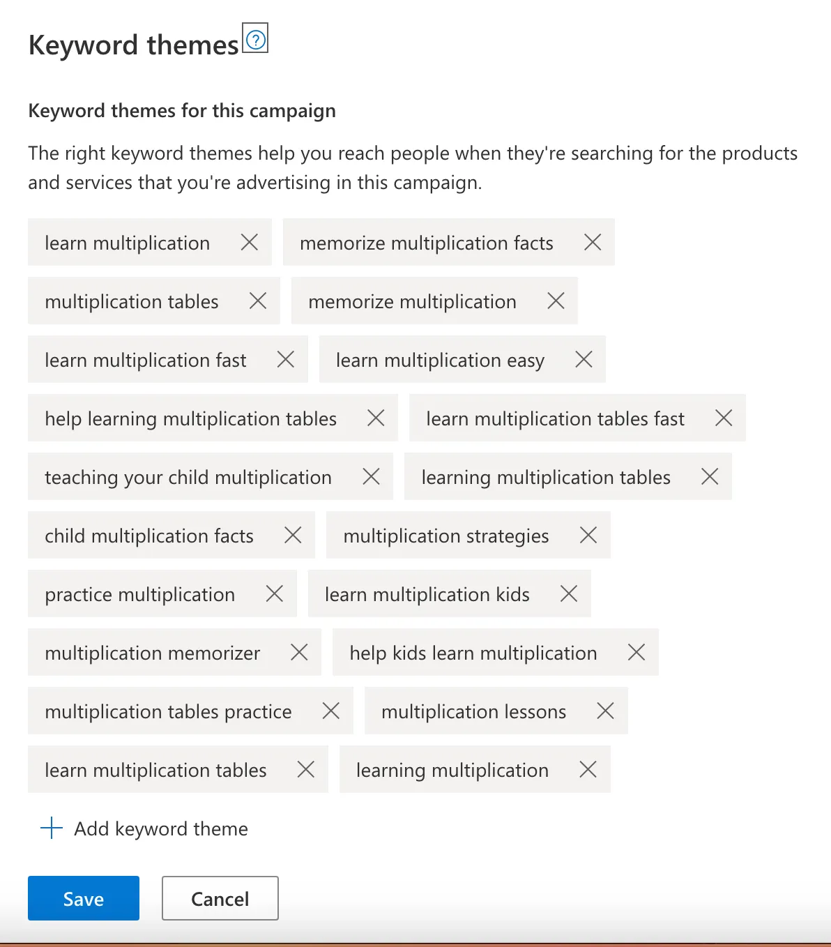
Variation B Keyword Themes

In a future post, I'll go more in depth into the Bing Ads campaign (this post has already gone on for a while... lol... if you're still reading, congratulations... you're a masochist).
Conclusion:
In the end, the product owner decided not to continue running ads for this product. Due to budgetary constraints and a lack of time to devote to this project, the product owner was never able to devote enough ad spend to REALLY get this product off the ground.
That all said, this was still a wildly successful A/B test that we learned a TON from… and I hope you did to.
If you’re interested in my services at all, please don’t hesitate to reach out to me either by phone or by scheduling a meeting
Until next time, happy growing!”